
Over the past few weeks, I’ve been writing about how internal technology teams, whether IT, Digital or other permutations, might look at themselves though a service value lens to better understand what they do in the eyes of their “customers”. If you haven’t seen the articles, they are here, here and here.
Last week I had the opportunity to work with a client to explore these ideas in a bit more detail. What follows is a description of what we did and what we discovered as a result, with a level of anonymity applied to protect the client’s identity.
Preparation – another pack of cards
For those of you who follow my musings, you will know that I’m a bit obsessed with creating sets of playing cards to help people to explore ideas (my next set are currently being designed and will be available to purchase in early 2023 – find out more here!).
The challenge of exploring user groups, jobs to be done and users looked perfect for exploring through the medium of cards. So here are the cards I created (virtually using Miro and on Artefact Cards for the physical experience).
There are three suits to the cards – a set of different User Groups (those distinct groups of people to whom a technology team may be providing services):

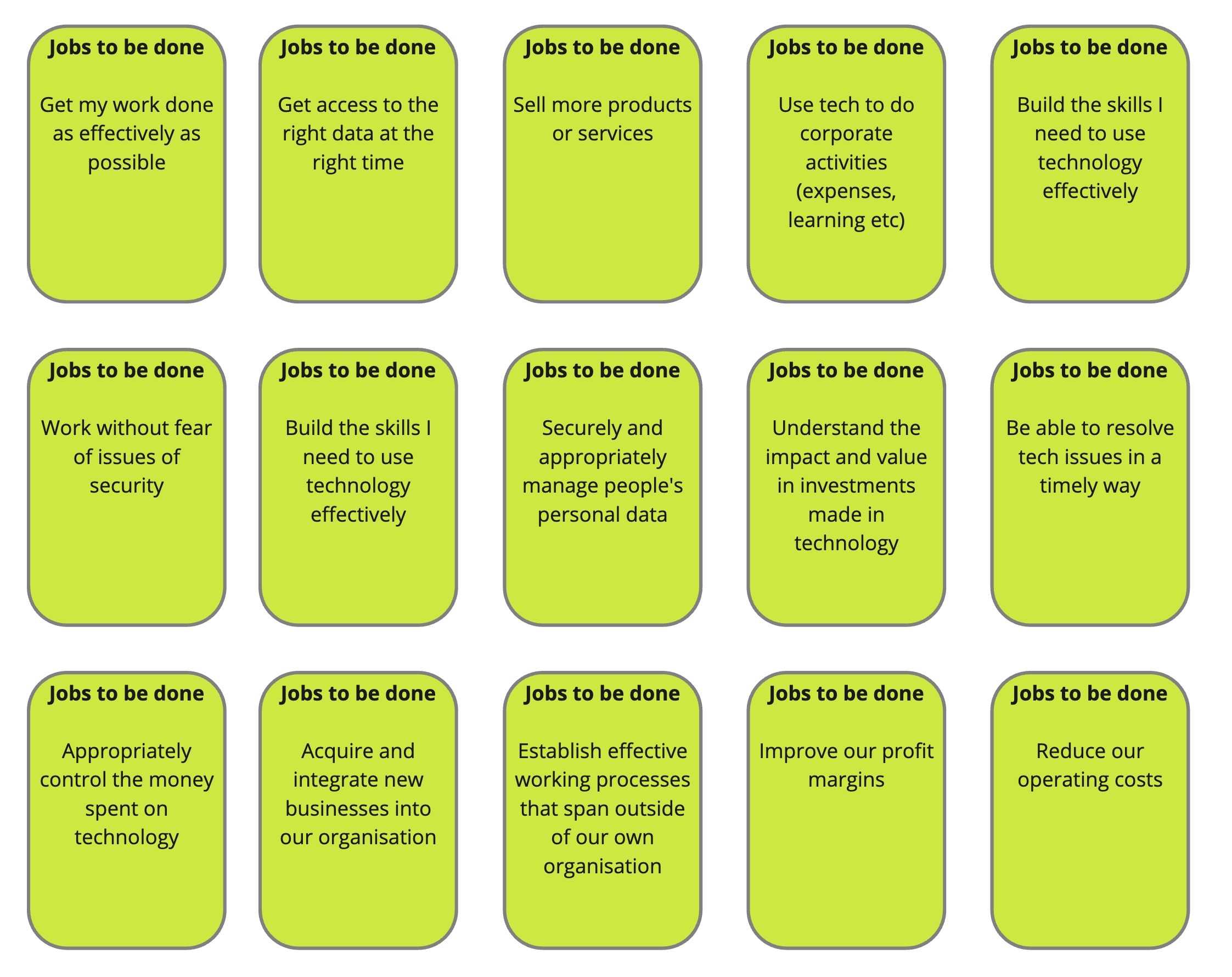
A set of “Jobs to be done” cards (the things those user groups might be needing to do which might be aided by the technology team)…
And a set of Services cards (the discrete services that a technology team might provide):

I’ve written before about how cards promote a kind of interaction and engagement that I simply struggle to get using whiteboards and Post Its. I don’t know why that is, but I continue to take advantage of the phenomenon.
A warm-up
The session I organised with my client last week was one-to-one in a meeting room with a big table and a whiteboard.
We started by playing a sorting game that used the CIO Priorities cards that I’ve had knocking about for a number of years now.
The cards are a series of 50 things that a CIO or CDO might be trying to do. they don’t amount to a coherent strategy (some are deliberately contradictory) but they can help to quickly understand where a particular team is at a point in time.
The sorting game simply asked the question “Is this priority done, being done, to do or simply not applicable?” The aim was to get a feel for what was currently in play, and the exercise in turn showed that there was a huge amount going on.
Understanding user groups
The next exercise became an attempt to draw out a kind of Venn diagram to explore the various user groups that the client’s team served. The ten user group cards helped to prompt ideas, but the client’s actual map of internal and external users became significantly more complex because of the nature of the organisation.
As a government organisation, the “End consumer of our services” user group also needed to have a significant element of unpacking.
Mapping user groups to Jobs to be Done to services
First of all, we picked one of the “End consumer of our services” user groups to map out which of the 15 Jobs to be Done cards were applicable. The answer was in fact relatively few, as the end user of external services don’t really see much in the way of benefit from the internal machinations of a technology team. It looked a little something like this:
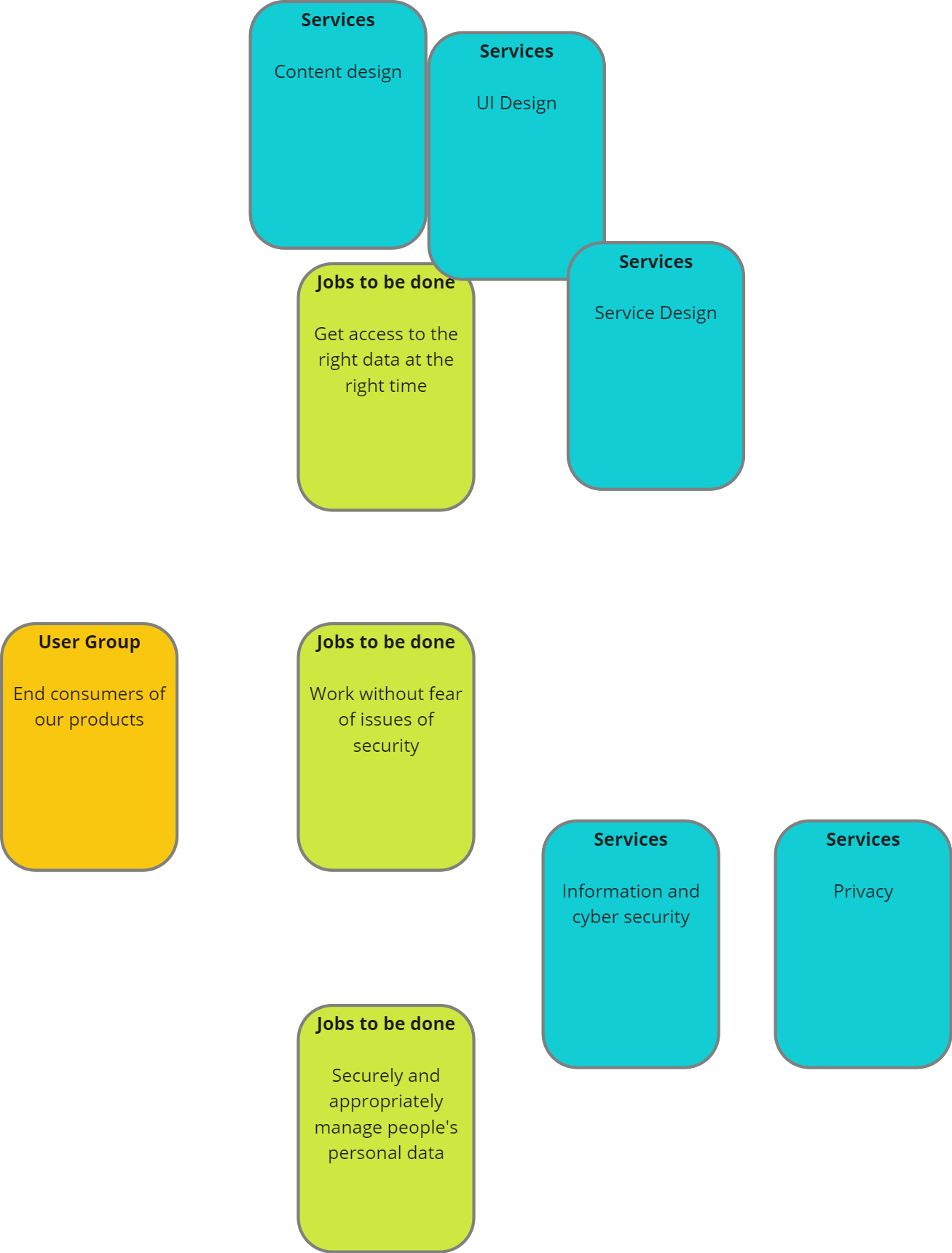
This isn’t to say that all of the other Services are adding value, just that they’re not adding value directly to an end consumer. I don’t think that that is particularly uncommon.
Next, however, we looked at the “Managers who commission technology change” user group, and this was where we really started to understand current services, the split of responsibilities and where there were opportunities to evolve and improve services.
For this group, there was a more broad set of Jobs to be done:

As we started to plot out the appropriate Services cards, they started to fall into four categories: those services provided by the client’s team, those provided by others in the organisation, and whether those services were working well or needed improvement. A 2×2 along these lines:

And from that, in turn, we identified a handful of areas where there is opportunity to improve: building up of a business relationship management approach that looks at building stronger relationships across the operational business, a new approach to making supply decisions about building or buying technology and a couple of others. Some tangible areas for improvement that are not just focused on the technology the team supplies.
Conclusions
A few thoughts:
- The approach enabled us in a few hours to work out some key areas for service improvement.
- Using the CIO Priorities cards up front was useful for scene setting, but didn’t really tie into the later work closely enough.
- Identifying user groups needs a bit more structure. There is a lot of overlap in groups, and plotting them needs more thought.
- Working out the most important groups to then focus on became quite obvious quite quickly, but I’m not sure that that will be clear immediately in other scenarios.
- The client enjoyed the approach. It got them thinking around their business, and the cards provided structure without being too rigid.
I’m continuing to experiment – if you would like to be a guinea pig for a future session, please drop me a line!

One thought on “The tech team value prop – field experiments”