
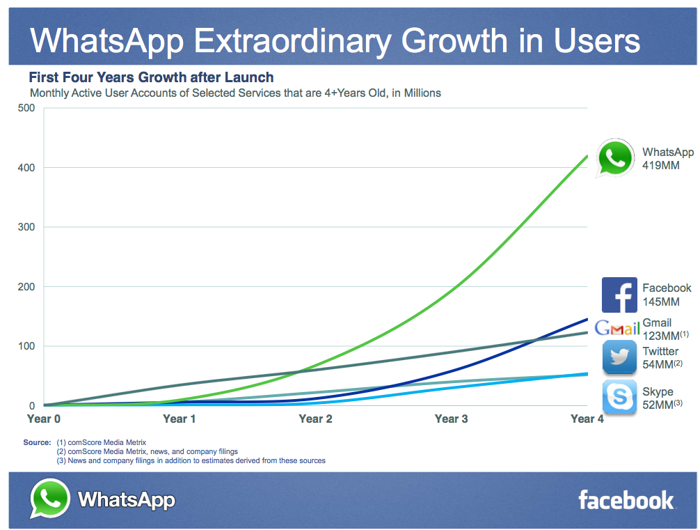
There are times when I reckon I just don’t get it. The world out there is different to the way I think, and I’ve got some sort of gap in my cognitive abilities. Last night’s news about the WhatsApp purchase by Facebook (for anything up to a report $19Bn) was one of the those times, and the graph above the case in point.
LOOK AT THE PHENOMENAL GROWTH!!! shouted too many business and tech blogs to mention. Look how in its first four years WhatsApp has totally outpaced all that have gone before it.
I’ve discussed hockey sticks on these pages before. The chart above shows how stupidly misleading they can be (well, at least in the slightly non-fully functioning brain of mine that vaguely gets maths). What it shows is that there has been phenomenal growth in the number of Internet users globally since the days of the launch of those others services.
Let’s redraw it – this time with the same period of time running along the bottom:

The blue line is the number of Internet users in the world (about 2.5bn on the numbers I found). The red line is Facebook’s users. The green line WhatsApp. The yellow, LinkedIn (an exception to prove the rule). Notice how they are all following a similar curve? Yep, they’re tracking the growth of the Internet.
No don’t get me wrong – what WhatsApp have done is an incredible achievement. But their growth needs to be put in context of the overall available Internet population, not just compared user-to-user against the first four years of other web services. That is meaningless. One could argue, actually, that the network effect increasingly improving the value of the Internet as a whole means that a good performing growth curve now would be one outpacing Internet growth (which will in the coming years slow as we get closer to the total population being online).
Does their achievement justify a valuation on their company greater than the majority of companies in the FTSE100? Well, I haven’t got it to spend, and Mr Zuckerberg apparently has…
(You can find the data to play around with the chart yourself here: https://docs.google.com/spreadsheet/ccc?key=0Aop0FWYa1e8KdFBJSkozMW1ubXBnUW1DdVEwZ3pheUE&usp=sharing)

2 thoughts on “Bloody hockey sticks”